# Recode those that say not sure to independent
nes$pid7[nes$pid7 == "Not sure"] <- "Independent"
# Turn it into numeric instead of factors
nes$pid7 <- as.numeric(nes$pid7)

regression <- lm( # fit a linear regression
    formula = fthrc ~ pid7 # predict feelings toward hillary clinton with party identification
    , data = nes # these data are from the nes dataset
)

modelsummary( # make table of regression results
    regression, # with the bivariate regression model from above
    notes = c(
        "Data source: NES dataset.",
        "Coefficient estimates from OLS.",
        "Standard errors in parentheses" # add a note to tell people how this model was created and with what data.
    ),
    stars = TRUE # print out the stars to show my p-values
)23 Post-estimation diagnostics
In an earlier exercise, we had discussed the role of residuals as a way to help us examine how well a line of best fit helps us predict our data. The difference between the predicted value from our regression line and the actual data (our residual) helps us identify how off our model is.
As we have discussed before, we could fit a line that perfectly predicts all of the data, but with linear regression, we are assuming that the relationship between our independent and dependent variables is linear. This is a pretty strong assumption to make. It has a number of consequences as well. One thing we want to make sure of when we fit a linear regression is that on average, our residuals are close to zero. The closer to zero the average of our residuals are, it means that we our line is, on average, predicting our individual data points. The other thing we want to be sure of is that our residuals are not large in some places but small in others. What this would imply is that our regression model predicts some values of our independent variable better than at other values of our independent variable. If this occurs, that is a problem.
So how can we check our residuals? One useful package for doing this is the car package (Fox and Weisberg 2019).
Let me first fit a bivariate regression model to examine the effect that someone’s partisan affiliation has on their feelings toward Hillary Clinton.
| (1) | |
|---|---|
| (Intercept) | 85.261*** |
| (1.567) | |
| pid7 | −11.748*** |
| (0.376) | |
| Num.Obs. | 1164 |
| R2 | 0.456 |
| R2 Adj. | 0.456 |
| AIC | 10972.2 |
| BIC | 10987.4 |
| Log.Lik. | −5483.087 |
| RMSE | 26.89 |
| + p < 0.1, * p < 0.05, ** p < 0.01, *** p < 0.001 | |
| Data source: NES dataset. | |
| Credit: damoncroberts.com | |
| Coefficient estimates from OLS. | |
| Standard errors in parentheses |
After I’ve interpreted the table of results, I can start to check how well my regression model actually preformed. In the past, we’ve talked about the Adjusted-\(R^2\) as a useful way to examine the proportion of the variance in feelings toward Hillary Clinton explained by party affiliation. However, there is much more information we should try to understand about how well our model performs. To show you just how much information R collects on our data, we can take a peak at the regression object and everything within it.
str(
    regression
)
List of 13
$ coefficients : Named num [1:2] 85.3 -11.7
..- attr(*, "names")= chr [1:2] "(Intercept)" "pid7"
$ residuals : Named num [1:1164] 2.49 13.73 -13.77 -4.51 -25.52 ...
..- attr(*, "names")= chr [1:1164] "1" "2" "3" "4" ...
$ effects : Named num [1:1164] -1466.1 840.4 -14.3 -4.1 -25.9 ...
..- attr(*, "names")= chr [1:1164] "(Intercept)" "pid7" "" "" ...
$ rank : int 2
$ fitted.values: Named num [1:1164] 73.5 38.3 14.8 73.5 26.5 ...
..- attr(*, "names")= chr [1:1164] "1" "2" "3" "4" ...
$ assign : int [1:2] 0 1
$ qr :List of 5
..$ qr : num [1:1164, 1:2] -34.1174 0.0293 0.0293 0.0293 0.0293 ...
.. ..- attr(*, "dimnames")=List of 2
.. .. ..$ : chr [1:1164] "1" "2" "3" "4" ...
.. .. ..$ : chr [1:2] "(Intercept)" "pid7"
.. ..- attr(*, "assign")= int [1:2] 0 1
..$ qraux: num [1:2] 1.03 1.01
..$ pivot: int [1:2] 1 2
..$ tol : num 1e-07
..$ rank : int 2
..- attr(*, "class")= chr "qr"
$ df.residual : int 1162
$ na.action : 'omit' Named int [1:14] 831 961 964 1050 1065 1069 1076 1087 1100 1101 ...
..- attr(*, "names")= chr [1:14] "831" "961" "964" "1050" ...
$ xlevels : Named list()
$ call : language lm(formula = fthrc ~ pid7, data = nes)
$ terms :Classes 'terms', 'formula' language fthrc ~ pid7
.. ..- attr(*, "variables")= language list(fthrc, pid7)
.. ..- attr(*, "factors")= int [1:2, 1] 0 1
.. .. ..- attr(*, "dimnames")=List of 2
.. .. .. ..$ : chr [1:2] "fthrc" "pid7"
.. .. .. ..$ : chr "pid7"
.. ..- attr(*, "term.labels")= chr "pid7"
.. ..- attr(*, "order")= int 1
.. ..- attr(*, "intercept")= int 1
.. ..- attr(*, "response")= int 1
.. ..- attr(*, ".Environment")=<environment: R_GlobalEnv>
.. ..- attr(*, "predvars")= language list(fthrc, pid7)
.. ..- attr(*, "dataClasses")= Named chr [1:2] "numeric" "numeric"
.. .. ..- attr(*, "names")= chr [1:2] "fthrc" "pid7"
$ model :'data.frame': 1164 obs. of 2 variables:
..$ fthrc: int [1:1164] 76 52 1 69 1 1 60 0 3 87 ...
..$ pid7 : num [1:1164] 1 4 6 1 5 4 1 7 4 1 ...
..- attr(*, "terms")=Classes 'terms', 'formula' language fthrc ~ pid7
.. .. ..- attr(*, "variables")= language list(fthrc, pid7)
.. .. ..- attr(*, "factors")= int [1:2, 1] 0 1
.. .. .. ..- attr(*, "dimnames")=List of 2
.. .. .. .. ..$ : chr [1:2] "fthrc" "pid7"
.. .. .. .. ..$ : chr "pid7"
.. .. ..- attr(*, "term.labels")= chr "pid7"
.. .. ..- attr(*, "order")= int 1
.. .. ..- attr(*, "intercept")= int 1
.. .. ..- attr(*, "response")= int 1
.. .. ..- attr(*, ".Environment")=<environment: R_GlobalEnv>
.. .. ..- attr(*, "predvars")= language list(fthrc, pid7)
.. .. ..- attr(*, "dataClasses")= Named chr [1:2] "numeric" "numeric"
.. .. .. ..- attr(*, "names")= chr [1:2] "fthrc" "pid7"
..- attr(*, "na.action")= 'omit' Named int [1:14] 831 961 964 1050 1065 1069 1076 1087 1100 1101 ...
.. ..- attr(*, "names")= chr [1:14] "831" "961" "964" "1050" ...
- attr(*, "class")= chr "lm"So I see that R has stored some information about my residuals in the regression object. I can easily extract that information and make a histogram with it.
    ggplot(
    ) + # make a plot
    geom_histogram( # specifically a histogram
        aes(x = regression$residuals), # and put the residuals from the regression on the x-axis
        color = "#000000", # make the lines between the bars black
        fill = "#D3D3D3" # fill the bars with a light grey color
    ) +
    geom_vline( # add a vertical line
        xintercept = mean(regression$residuals), # the vertical line should be the mean value of my residuals
        color = "#000000", # the color of the line should be black
        linetype = 2 # and I want the line to be dotted
    ) +
    theme_minimal() + # apply the minimal theme to it
    labs( # adjust some of the labels
        x = "Residuals", # make x-axis label this
        y = "Count", # make y-axis label this
        caption = "Plot of residuals from model."
    )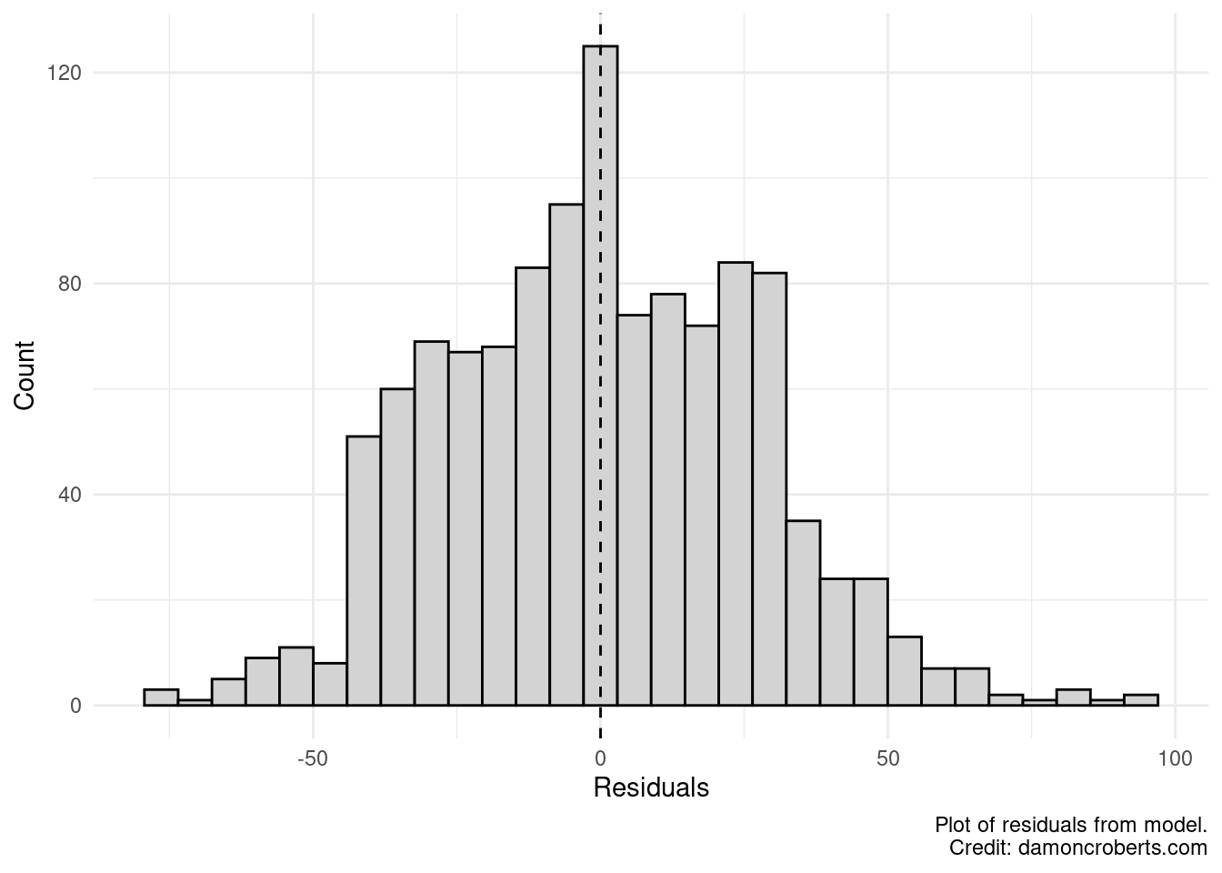
Let’s look at this quickly. Does it look like the average of our residuals is at 0? Yeah, pretty close. Does it look like our model consistently does a good job at predicting my data? No, it looks like my residuals are quite a bit higher in some places but not others. If my model was consistently good at predicting my data, then it would look more like a bell curve.
What this doesn’t tell us is where we our model is doing a bad job. So let’s use the car package to look at the size of our residuals at different values of our gender variable.
residualPlot( # make plot of my residuals
    regression # for my regression model
    , id = list(n = 10, cex=.7,location="lr") # some extra options
)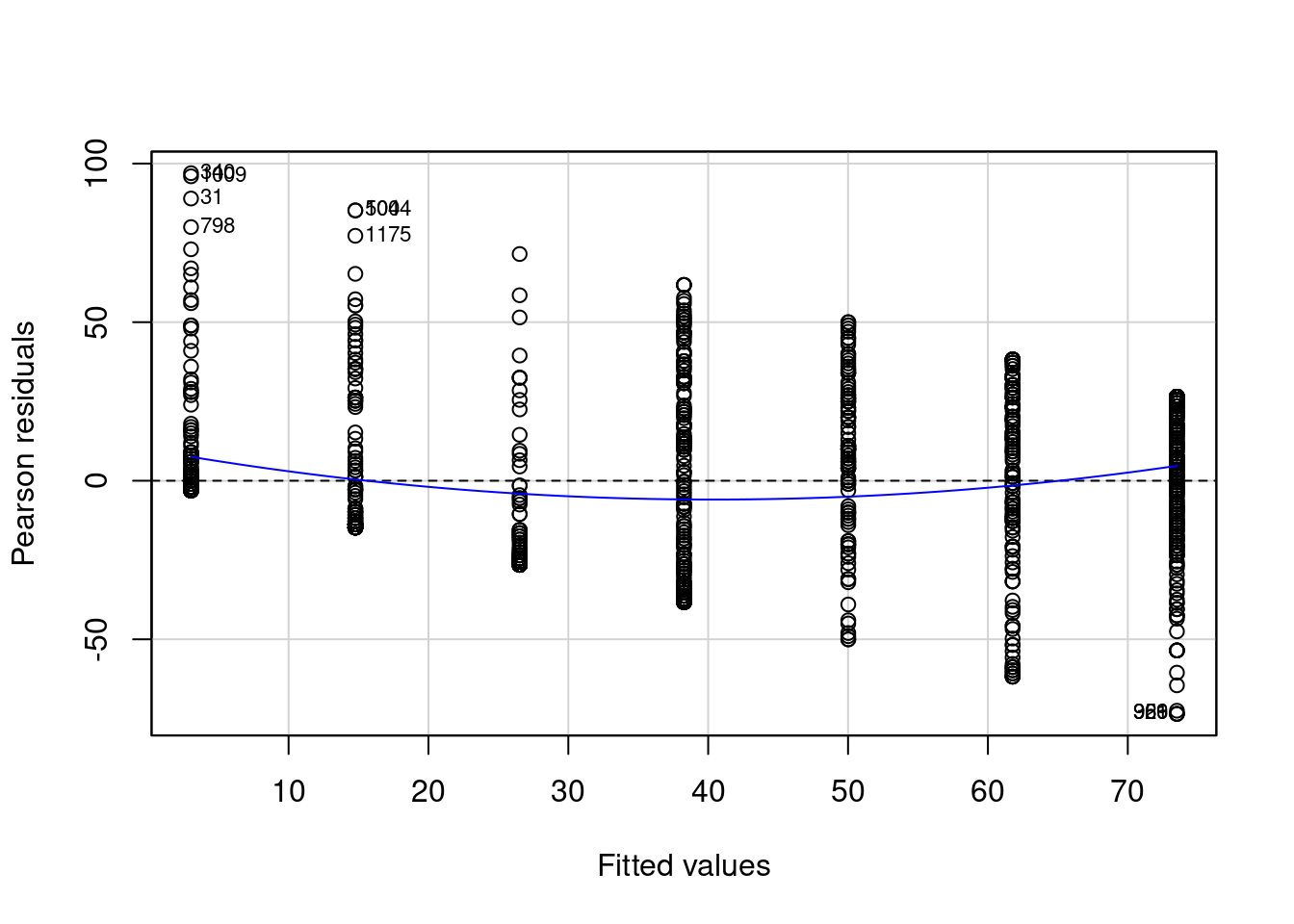
It looks like my residuals get more negative and large when I am trying to predict feelings toward Hillary Clinton for Republicans. I also see that the blue line is not really flat and is not at 0 across the plot. This tells me that the variance of my residuals is not consistent. This is a violation of one of my assumptions. It is bad because it means my model is doing a better job at predicting my data in some places but not in others.
Could this because I have some particular observations that are really extreme? For example, I can have some Democrats that really love Hillary Clinton and some Republicans that really hate Hillary Clinton. I can look for these outliers that have leverage on my regression. In other words, I don’t really care about outliers that don’t matter to my regression, but I do care about outliers that drastically change my regression because of how extreme they are.
influencePlot( # make a leverage plot
    regression, # using my regression
    id=list(
        method="noteworthy"
        , n=10
        , cex=0.7
        , location="lr"
    )
)
StudRes Hat CookD
8 -0.1125069844 0.003118505 1.981532e-05
14 -0.0008951829 0.003118505 1.254499e-09
15 -0.0753028256 0.003118505 8.877022e-06
22 -0.0380989361 0.003118505 2.272333e-06
27 -0.1125069844 0.003118505 1.981532e-05
31 3.3259694070 0.003118505 1.715398e-02
34 -0.1125069844 0.003118505 1.981532e-05
53 0.2595384517 0.003118505 1.054448e-04
55 -0.0008951829 0.003118505 1.254499e-09
57 -0.0753028256 0.003118505 8.877022e-06
340 3.6282632710 0.003118505 2.037735e-02
359 -2.7424994504 0.002179730 8.169266e-03
500 3.1827874265 0.001984992 9.995577e-03
798 2.9868126979 0.003118505 1.385921e-02
921 -2.7424994504 0.002179730 8.169266e-03
966 -2.7424994504 0.002179730 8.169266e-03
1009 3.5904315975 0.003118505 1.995926e-02
1044 3.1827874265 0.001984992 9.995577e-03
1074 2.4984442819 0.003118505 9.719802e-03
1153 2.4234538091 0.003118505 9.147974e-03
1159 2.7236369120 0.003118505 1.153929e-02
1175 2.8817831792 0.001984992 8.207156e-03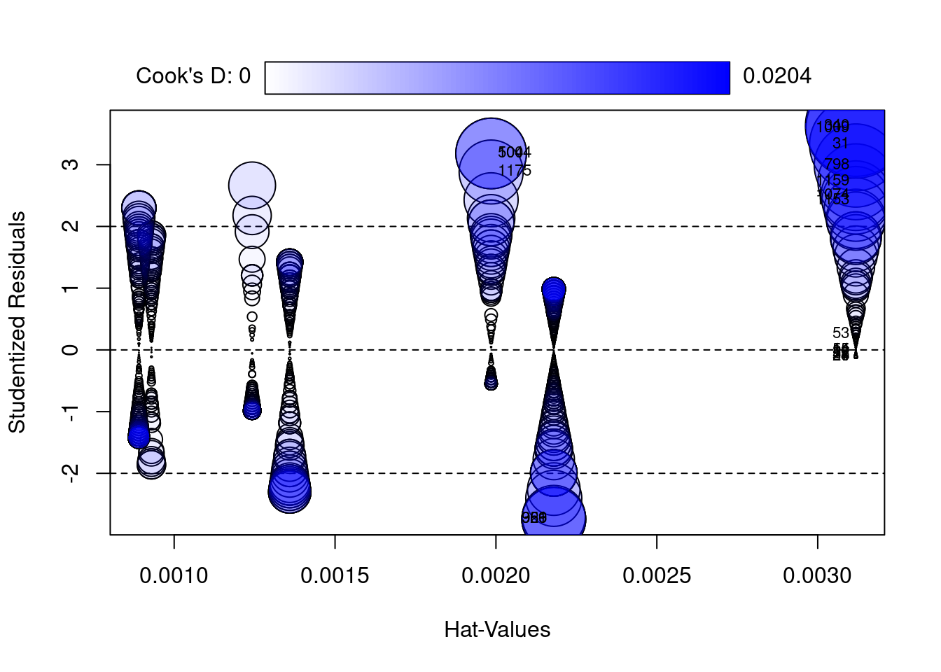
Yeah, it looks like I do have some pretty extreme values. There are some Republicans that really hate Hillary Clinton and some Democrats that really love her. And these people look much different than other Republicans and Democrats.
There is another potential problem here. I might have a confounding variable here. If I have a confounding variable that I haven’t accounted for, then my model won’t be very good right? Unless I control for this confounding variable, I may be mistaking the effect of someone’s partisan affiliation on feelings toward Clinton with my confounding variable.
One example would be gender. It is reasonable to assume that someone’s gender explains both someone’s feelings toward Clinton and their partisan identification. That is, men are more likely to be Republican and more likely to dislike Hillary Clinton whereas women are more likely to be Democratic and more likely to like Hillary Clinton.
Let me see if my residuals look better when I account for gender too.
multivariate_regression <- lm( # fit a linear regression
    formula = fthrc ~ pid7 + gender # predict feelings toward hillary clinton with party identification
    , data = nes # these data are from the nes dataset
)

modelsummary( # make table of regression results
    multivariate_regression, # with the bivariate regression model from above
    notes = c(
        "Data source: NES dataset.",
        "Coefficient estimates from OLS.",
        "Standard errors in parentheses" # add a note to tell people how this model was created and with what data.
    ),
    stars = TRUE # print out the stars to show my p-values
)| (1) | |
|---|---|
| (Intercept) | 83.153*** |
| (1.811) | |
| pid7 | −11.689*** |
| (0.376) | |
| genderFemale | 3.646* |
| (1.579) | |
| Num.Obs. | 1164 |
| R2 | 0.459 |
| R2 Adj. | 0.458 |
| AIC | 10968.8 |
| BIC | 10989.1 |
| Log.Lik. | −5480.422 |
| RMSE | 26.82 |
| + p < 0.1, * p < 0.05, ** p < 0.01, *** p < 0.001 | |
| Data source: NES dataset. | |
| Credit: damoncroberts.com | |
| Coefficient estimates from OLS. | |
| Standard errors in parentheses |
Let’s look at those residuals now!
    ggplot(
    ) + # make a plot
    geom_histogram( # specifically a histogram
        aes(x = regression$residuals), # and put the residuals from the regression on the x-axis
        color = "#000000", # make the lines between the bars black
        fill = "#D3D3D3" # fill the bars with a light grey color
    ) +
    geom_vline( # add a vertical line
        xintercept = mean(regression$residuals), # the vertical line should be the mean value of my residuals
        color = "#000000", # the color of the line should be black
        linetype = 2 # and I want the line to be dotted
    ) +
    theme_minimal() + # apply the minimal theme to it
    labs( # adjust some of the labels
        x = "Residuals", # make x-axis label this
        y = "Count", # make y-axis label this
        caption = "Plot of residuals from model."
    )
We can see that the residuals look more like a bell-curve and the average of my residuals looks really close to zero. Which is good! But let’s look at this a different way.
residualPlot( # make plot of my residuals
    regression # for my regression model
    , id = list(n = 10, cex=.7,location="lr") # some extra options
)
Again, we see that our residuals look more like the way we’d want them to: a bell curve (constant variance) and that the mean of our residuals is closer to zero.
But let’s see how our regression line performs for each of our independent variables when we account for the other ones.
avPlots( # make a added variable plot
    multivariate_regression # with the multivariate regression
    , intercept = FALSE # do not include the intercept term
    , id=list( # some extra options
        n=5
        , cex=.7
        , location="lr"
    )
    , grid = FALSE
)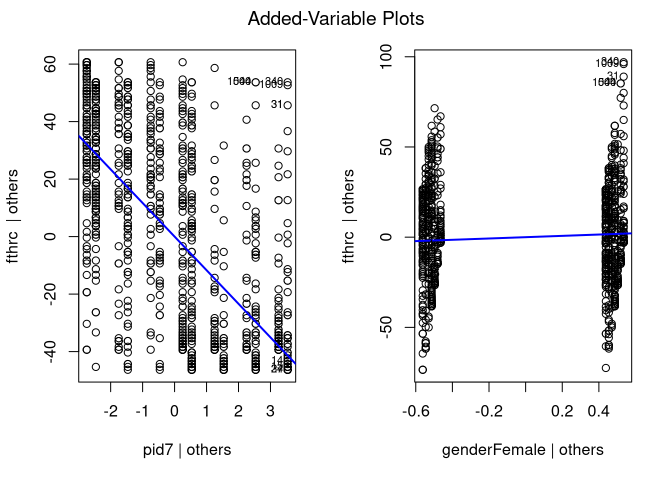
It doesn’t look like we have too many really weird outliers. Even when accounting for partisan identification, we still see some Female respondents that rate Hillary Clinton extremely high. So we should be cognizant of that. But overall, it seems to be doing much better than before.
My personal favorite package to make diagnostic plots would be the lindia package (Lee and Ventura 2017). I can make all of these plots with a single command.
gg_diagnose(
    multivariate_regression
)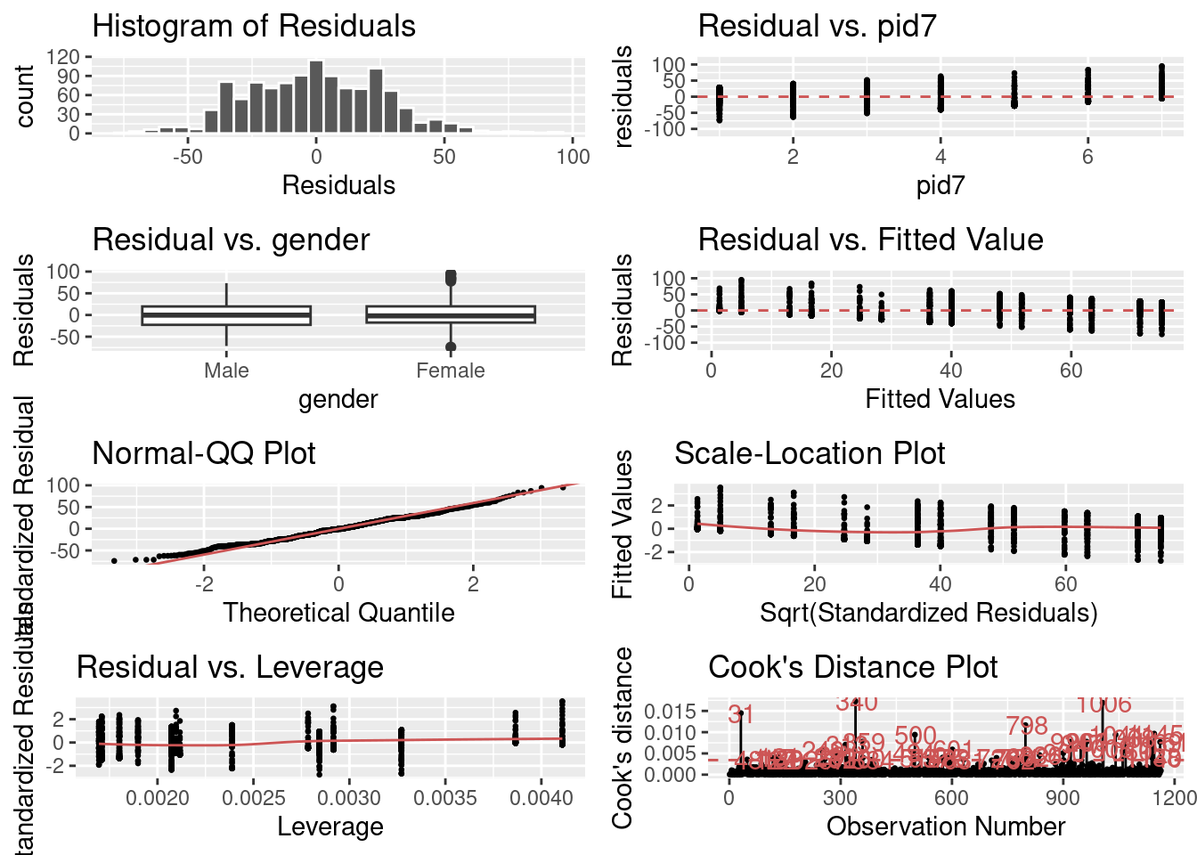
The first grid gives me a histogram of my residuals. I want the average value to be at about 0 and for it to be normally distributed (bell-curve).
The second plot let’s me observe my residuals for the party identification variable when accounting for gender. The third plot lets me observe my residuals for the gender variable when accounting for party identification. For both of these, I want my residuals to be relatively small and equivalent across values of my independent variable. In both situations, they are pretty close. It looks like there is still something going on with my party identification variable, however. Perhaps other confounders like education level, race, and age?
The fourth plot lets me view the differences between my residuals and fitted values. It looks like that there are big clusters of my residuals around zero across all of my fitted values which is good. Though, there may be some problems where some of my residuals are large and positive at lower values and large and negative at higher values. So I might want to check for unequal variance in my residuals.
The fifth plot lets me see how well my residuals fit a normal distribution. The red line is what I should have if my residuals are normally distributed. For the most part, they appear to be normally distributed. But there are some differences.
The sixth and seventh plots lets me see whether I have outliers with too much leverage. It appears that I probably do.
And the last plot lets me see a different representation of whether I have some residuals that are drastically higher than others. It appears that I do. But it doesn’t look like there is any clear cluster of spikes. Which is good. It means that the variance in my residuals isn’t systematically different. Which holds up with my Normal QQ Plot. There are some spikes, but nothing that looks really obvious.
23.1 Some final notes
- There are multiple ways to diagnose regression models. Whichever package you use is fine. Just make sure that you discuss how the plots you produce for the diagnostics answer questions about the appropriateness of the model.
- No matter how you try to diagnose your regression model, there is a lot of subjectivity. For some, people will read the diagnostics and not be concerned, while others will see the same diagnostics and be really concerned. What matters is that you think carefully about what the residuals tell us about the regression model. If there are some weird abnormalities, then there definitely might be a problem. But what is abnormal to some varies. Just be honest and transparent about the way that you are evaluating these diagnostics.
- For an R script to replicate what we did in this exercise, go to this page.