%%{init: {'theme':'base', 'themeVariables':{'primaryColor':'#ffffff', 'primaryBorderColor': '#000000'}}}%%
graph LR
A[Presence of Sun] --> B[Temperature]
13 Expectations about bivariate relationships
Why are we collecting data and describing variables in isolation or patterns between two variables in the first place? While this is kind of a meta question, it is an important one to address.
In science we want to explain phenomenon. We want to deepen our understanding of the world. We can certainly use observation to help with this. However, the world can be an extremely complex place. Phenomenon may occur for multiple reasons or they may occur for a single reason that appears like it might be caused for multiple reasons.
While we can provide observational evidence explaining that the reason it is warmer during the day than during the night is because of the energy emitted from the surface of the sun, we might want to see whether this occurs because of the sun or if there is some other explanation that co-occurs with the sun but is what is actually causing differences in temperatures.
What we’ve done is developed a hypothesis. In this example, we’ve laid out an expectation that the sun makes the earth warmer. Now, how can we demonstrate whether our hypothesis is correct or not? We can just tell people, “Hey, notice how it is warmer when the sun is up? That is because of the sun!” People may have not made this same conclusion or noticed this pattern before. So they may doubt you. What you need to do, is provide some sort of evidence demonstrating that this pattern indeed exists.
One such way of providing evidence of this pattern is by collecting data on each feature (temperature and presence of the sun) in isolation and then demonstrating the pattern between the two. First, we can develop a tool to measure heat - a thermometer. Next, we can develop a procedure where we check every so often to see if the sun is still in the sky, record whether it was or not. While we do this we can then look over to our thermometer and record the temperature. What we can then do is examine the patterns by which the temperature is higher and whether the sun is present or not. We can do this by constructing something like the two-way boxplot that we pulled together in the exercise on examining simple bivariate relationships.
What if, however, someone comes to you and says: “No its not the sun that explains temperature, it is the presence of clouds.” You may think to yourself “Well, yeah, the presence of clouds could definitely contribute to this, but even when it is not cloudy I can have either a cold or warm day. I still think the biggest factor is the sun.”
The alternative hypothesis this person presents may be what we call a confounding variable. We have this expectation about the world that we can simplify into what is called a “model”. In our simplest form of our model, we believe what is presented in Figure 14.1 But now, we may be expecting a slightly more complicated “model” of the world as shown in Figure 13.2.
%%{init: {'theme':'base', 'themeVariables':{'primaryColor':'#ffffff', 'primaryBorderColor': '#000000'}}}%%

graph LR
A[Presence of Sun] --> B[Temperature]
C[Clouds] --> A
C --> B
So, what we need to do, to examine whether our intuitions are correct is determine how much of the influence that the sun has on the temperature is explained by the presence of clouds.
What we can do, is we can collect data on the temperature, the presence of the sun, but we can also record how much of the sky is covered by clouds when we record our temperature and the presence of the sun.
Now, what we can do, is examine the patterns between the sun and the temperature, but we can examine those patterns by holding our confounding variable constant.
This is really hard to do with the boxplot we may have made, right? Right. So we will have to be a bit more sophisticated in how we demonstrate these patterns now. What we can do, is do things like split our data up based on this confounding variable and create a mosiac plot for each of these two subsamples. If we have continuous data, we can build a scatter plot but add colors to the dots on the scatter plot based on the values that those observations take on for that confounding variable.
Let’s demonstrate each of these with an example to make it a bit less abstract.
13.1 Categorical data
For this first coding example, say that we have the following primary hypothesis
%%{init: {'theme':'base', 'themeVariables':{'primaryColor':'#ffffff', 'primaryBorderColor': '#000000'}}}%%
graph LR
A[Waffle Houses] --> B[Divorce]
Let me turn to a dataset from McElreath (2020). The dataset provides state-level data on marriage rates, divorce rates, population demographics, and more.
I am interested in examining the hypothesis depicted in Figure 13.3.
Let me first describe each of the variables in isolation. I do this to get an understanding of each of the variables themselves.
waffle_cat %>% # grab the cleaned nes dataset from above
    select( # grab the following columns
        WaffleHouses_Binary,
        Divorce_Cat
    ) %>%
    datasummary_skim(
        data = ., # use the dataset linked with the pipe operators
        notes = "Data source: Waffles dataset McElreath(2020).", # provide a caption for the table
        output = "summary_stats_1.docx" # save the output to this file
    )
?(caption)
| Unique (#) | Missing (%) | Mean | SD | Min | Median | Max | ||
|---|---|---|---|---|---|---|---|---|
| WaffleHouses_Binary | 2 | 0 | 0.5 | 0.5 | 0.0 | 0.5 | 1.0 |  |
| Divorce_Cat | 4 | 0 | −0.0 | 1.4 | −2.0 | 0.0 | 2.0 |  |
| Data source: Waffles dataset McElreath(2020). Credit: damoncroberts.com |
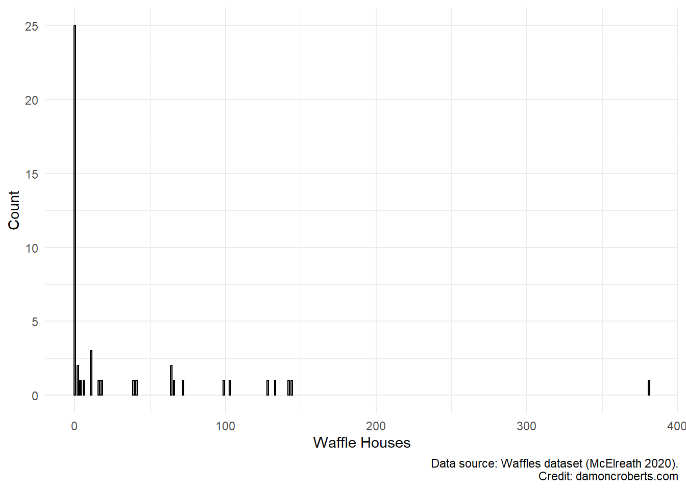
waffle_cat %>% # grab the waffles dataset
ggplot() + # make a plot with these data
geom_histogram( # specifically a histogram
aes(x = WaffleHouses_Cat), #put this column on the x-axis
fill = "grey", # fill the bars with a grey color
color = "black" # make the lines of the bars black
) +
theme_minimal() + # apply the minimal theme to it
labs( # change some labels
y = "Count", # change y axis label to this
x = "Waffle Houses", # change x axis label to this
caption = "Data source: Waffles dataset (McElreath 2020)" # add this note to the plot
)
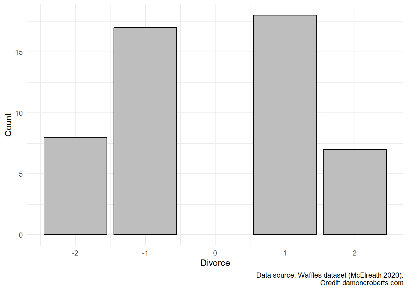
waffle_cat%>% # grab the waffles dataset
ggplot() + # make a plot with these data
geom_histogram( # specifically a histogram
aes(x = Divorce_Cat), # put this column on the x-axis
fill = "grey", # fill the bars with a grey color
color = "black" # make the lines of the bars black
) +
theme_minimal() + # apply the minimal theme to it
labs( # change some labels
y = "Count", # change y axis label to this
x = "Divorces", # change x axis label to this
caption = "Data source: Waffles dataset (McElreath 2020)" # add this note to the plot
)
Now I can look at patterns between these two variables.
waffle_cat %>% # use the waffles_cat dataset...
    datasummary_crosstab( # ... with the dataset, create a crosstab
        WaffleHouses_Cat ~ Divorce_Cat_Labelled, #... and use the two cleaned variables
        notes = "Data source: Waffles dataset (McElreath 2020)", # add notes to table
        data = ., # and use the dataset connected by the pipe operator
        output = "cleaner_bivariate_crosstab.docx" # store the table in this word document
)| WaffleHouses_Cat | Much lower than average | Lower than average | Higher than average | Much Higher than average | All | |
|---|---|---|---|---|---|---|
| No | N | 7 | 9 | 7 | 2 | 25 |
| % row | 28.0 | 36.0 | 28.0 | 8.0 | 100.0 | |
| Yes | N | 1 | 8 | 11 | 5 | 25 |
| % row | 4.0 | 32.0 | 44.0 | 20.0 | 100.0 | |
| All | N | 8 | 17 | 18 | 7 | 50 |
| % row | 16.0 | 34.0 | 36.0 | 14.0 | 100.0 | |
| Data source: Waffles dataset (McElreath 2020). Credit: damoncroberts.com |
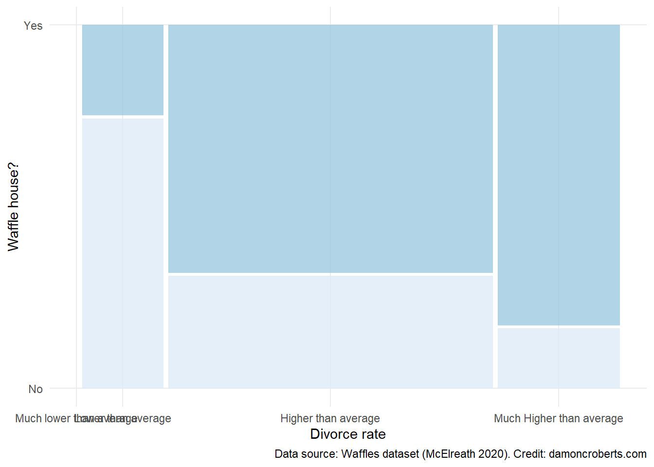
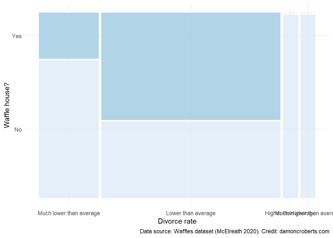
waffle_cat %>% # take the waffle_cat dataset
    ggplot() + # make a plot object
        geom_mosaic( # specifically a mosaic plot
            aes( # for the axes
                x = product( # on the x axis, plot the combination of the following variables
                    WaffleHouses_Cat,
                    Divorce_Cat_Labelled
                ),
                fill = WaffleHouses_Cat # fill it with the Divorce_Cat variable
            ),
        ) +
        theme_minimal() + # add this theme
        scale_color_brewer(
            name = "Waffle House?", # make this the legend title
            wes_palette("Moonrise3") # add these color palettes
            ) +
        labs( # adjust the labels to the plot
            x = "Divorce Rate", # x-axis label
            y = "Waffle House?", # y-axis label
            caption = "Data source: Waffles dataset (McElreath 2020)" # caption
        )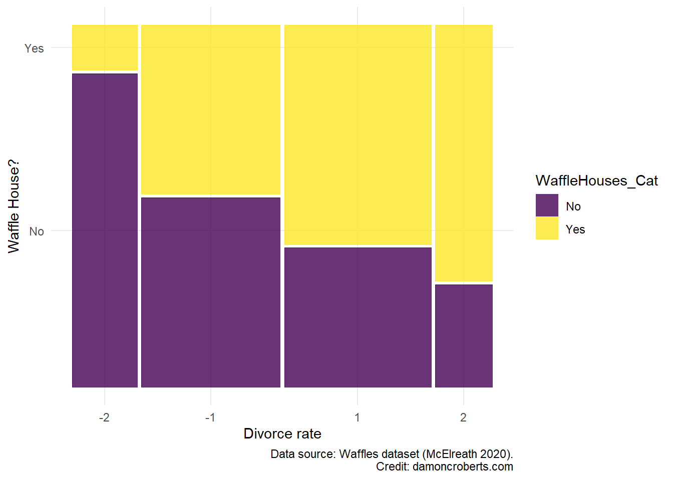
Now let’s say, I dig into the data a little bit more and wonder to myself (as any normal person would): “is this maybe really about waffles?” My new hypothesis is….
%%{init: {'theme':'base', 'themeVariables':{'primaryColor':'#ffffff', 'primaryBorderColor': '#000000'}}}%%

graph LR
A[Waffle Houses] --> B[Divorce]
C[Age of marriage] --> A
C --> B
I am going to again provide descriptive statistics of each of the variables by themselves. Then I’ll increase the complexity of my analysis a bit more.
waffle_cat %>% # grab the cleaned nes dataset from above
    select( # grab the following columns
        WaffleHouses_Binary,
        Age,
        Divorce_Cat,
    ) %>%
    datasummary_skim(
        data = ., # use the dataset linked with the pipe operators
        notes = "Data source: Waffles dataset McElreath(2020).", # provide a caption for the table
        output = "summary_stats_2.docx" # save the output to this file
    )
?(caption)
| Unique (#) | Missing (%) | Mean | SD | Min | Median | Max | ||
|---|---|---|---|---|---|---|---|---|
| WaffleHouses_Binary | 2 | 0 | 0.5 | 0.5 | 0.0 | 0.5 | 1.0 | |
| Age | 4 | 0 | 4.5 | 0.7 | 3.0 | 4.0 | 6.0 |  |
| Divorce_Cat | 4 | 0 | −0.0 | 1.4 | −2.0 | 0.0 | 2.0 | |
| Data source: Waffles dataset McElreath(2020). Credit: damoncroberts.com |
waffle_cat %>% # grab the waffles dataset
ggplot() + # make a plot with these data
geom_histogram( # specifically a histogram
aes(x = WaffleHouses_Cat), # put this column on the x-axis
fill = "grey", # fill the bars with a grey color
color = "black" # make the lines of the bars black
) +
theme_minimal() + # apply the minimal theme to it
labs( # change some labels
y = "Count", # change y axis label to this
x = "Waffle Houses", # change x axis label to this
caption = "Data source: Waffles dataset (McElreath 2020)" # add this note to the plot
)
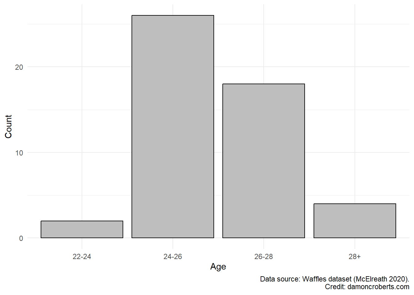
waffle_cat %>% # grab the waffles dataset
ggplot() + # make a plot with these data
geom_histogram( # specifically a histogram
aes(x = Age_Cat), # put this column on the x-axis
fill = "grey", # fill the bars with a grey color
color = "black" # make the lines of the bars black
) +
theme_minimal() + # apply the minimal theme to it
labs(# change some labels
y = "Count", # change the y axis label to this
x = "Age", # change the x axis label to this
caption = "Data source: Waffles dataset (McElreath 2020)" # add this note to the plot
)
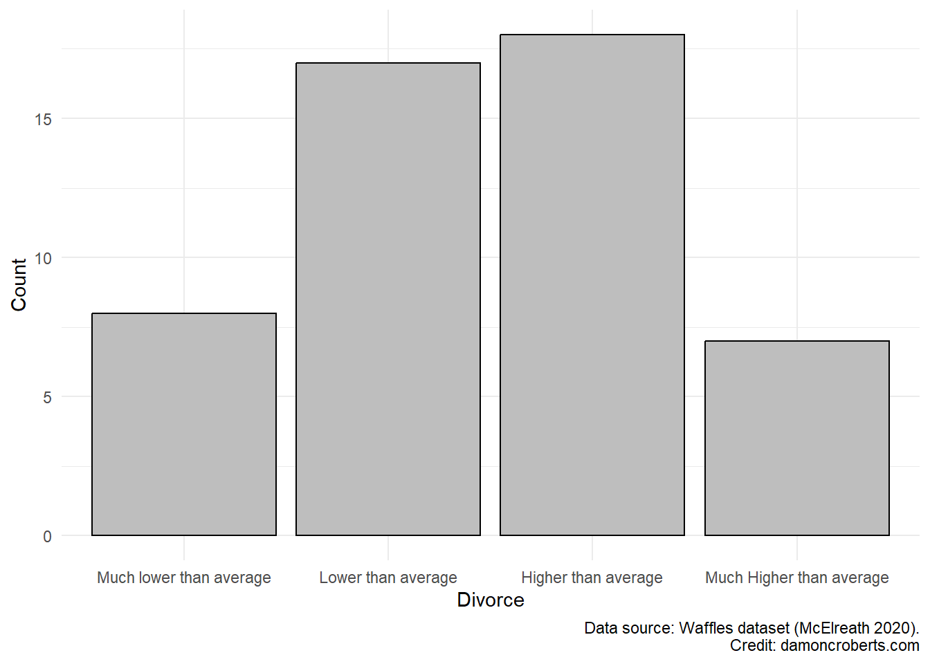
waffle_cat%>% # grab the waffles dataset
ggplot() + # make a plot with these data
geom_histogram( # specifically a histogram
aes(x = Divorce_Cat_Labelled), # put this column on the x-axis
fill = "grey", # fill the bars with a grey color
color = "black" # make the lines of the bars black
) +
theme_minimal() + # apply the minimal theme to it
labs( # change some labels
y = "Count", # change y axis label to this
x = "Divorces", # change x axis label to this
caption = "Data source: Waffles dataset (McElreath 2020)" # add this note to the plot
)
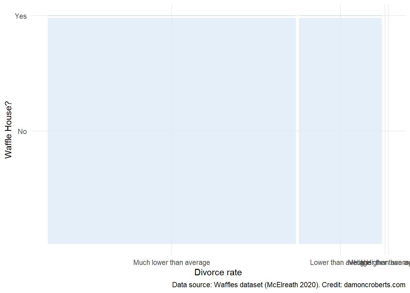
I’ve looked at each of the variables by themselves then have gotten a sense of the patterns between the two primary variables of interest. But now, let me consider what this looks like between varying age ranges.
To do this, I am going to make the same mosaic plot I made above, but am going to make one for each age category
waffle_cat %>% # take the waffle_cat dataset
    filter(Age_Cat == "22-24") %>% # grab this age subset
    ggplot() + # make a plot object
        geom_mosaic( # specifically a mosaic plot
            aes( # for the axes
                x = product( # on the x axis, plot the combination of the following variables
                    WaffleHouses_Cat,
                    Divorce_Cat_Labelled
                ),
                fill = WaffleHouses_Cat # fill it with the Divorce_Cat variable
            ),
        ) +
        theme_minimal() + # add this theme
        scale_fill_brewer(
            name = "Divorce rate", # make this the legend title
            wes_palette("Moonrise3") # add these color palettes
            ) +
        labs( # adjust the labels to the plot
            x = "Waffle House?", # x-axis label
            y = "Divorce rate", # y-axis label
            caption = "Data source: Waffles dataset (McElreath 2020)" # caption
        )

waffle_cat %>% # take the waffle_cat dataset
    filter(Age_Cat == "24-26") %>% # grab this age subset
    ggplot() + # make a plot object
        geom_mosaic( # specifically a mosaic plot
            aes( # for the axes
                x = product( # on the x axis, plot the combination of the following variables
                    WaffleHouses_Cat,
                    Divorce_Cat_Labelled
                ),
                fill = WaffleHouses_Cat # fill it with the Divorce_Cat variable
            ),
        ) +
        theme_minimal() + # add this theme
        scale_fill_brewer(
            name = "Divorce rate", # make this the legend title
            wes_palette("Moonrise3") # add these color palettes
            ) +
        labs( # adjust the labels to the plot
            x = "Waffle House?", # x-axis label
            y = "Divorce rate", # y-axis label
            caption = "Data source: Waffles dataset (McElreath 2020)" # caption
        )

waffle_cat %>% # take the waffle_cat dataset
    filter(Age_Cat == "26-28") %>% # grab this age subset
    ggplot() + # make a plot object
        geom_mosaic( # specifically a mosaic plot
            aes( # for the axes
                x = product( # on the x axis, plot the combination of the following variables
                    WaffleHouses_Cat,
                    Divorce_Cat_Labelled
                ),
                fill = WaffleHouses_Cat # fill it with the Divorce_Cat variable
            ),
        ) +
        theme_minimal() + # add this theme
        scale_fill_brewer(
            name = "Divorce rate", # make this the legend title
            wes_palette("Moonrise3") # add these color palettes
            ) +
        labs( # adjust the labels to the plot
            x = "Waffle House?", # x-axis label
            y = "Divorce rate", # y-axis label
            caption = "Data source: Waffles dataset (McElreath 2020)" # caption
        )

waffle_cat %>% # take the waffle_cat dataset
    filter(Age_Cat == "28+") %>% # grab this age subset
    ggplot() + # make a plot object
        geom_mosaic( # specifically a mosaic plot
            aes( # for the axes
                x = product( # on the x axis, plot the combination of the following variables
                    WaffleHouses_Cat,
                    Divorce_Cat_Labelled
                ),
                fill = WaffleHouses_Cat # fill it with the Divorce_Cat variable
            ),
        ) +
        theme_minimal() + # add this theme
        scale_fill_brewer(
            name = "Divorce rate", # make this the legend title
            wes_palette("Moonrise3") # add these color palettes
            ) +
        labs( # adjust the labels to the plot
            x = "Waffle House?", # x-axis label
            y = "Divorce rate", # y-axis label
            caption = "Data source: Waffles dataset (McElreath 2020)" # caption
        )
14 Continuous data
Thankfully I have these data as continuous data instead. Let me look at the exact same hypotheses presented in Figure 14.1 and Figure 13.7.
Again, first I am going to try to understand each variable in isolation first.
waffle_cat %>% # grab the cleaned nes dataset from above
    select( # grab the following columns
        WaffleHouses,
        Age,
        Divorce,
    ) %>%
    datasummary_skim(
        data = ., # use the dataset linked with the pipe operators
        notes = "Data source: Waffles dataset McElreath(2020).", # provide a caption for the table
        output = "summary_stats_3.docx" # save the output to this file
    )
?(caption)
| Unique (#) | Missing (%) | Mean | SD | Min | Median | Max | ||
|---|---|---|---|---|---|---|---|---|
| WaffleHouses | 22 | 0 | 32.3 | 65.8 | 0.0 | 1.0 | 381.0 |  |
| Age | 4 | 0 | 4.5 | 0.7 | 3.0 | 4.0 | 6.0 | |
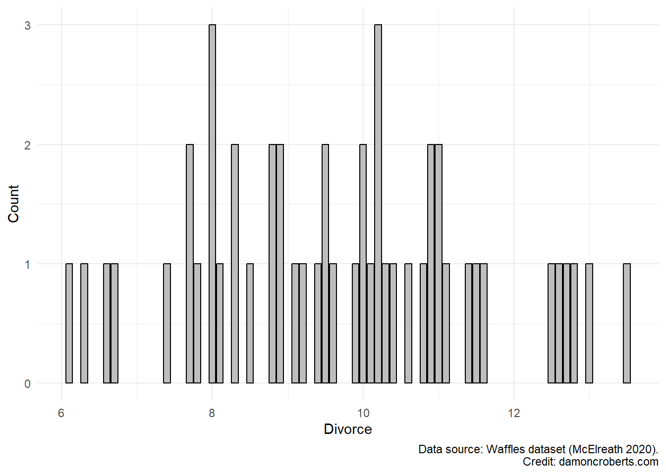
| Divorce | 38 | 0 | 9.7 | 1.8 | 6.1 | 9.8 | 13.5 |  |
| Data source: Waffles dataset McElreath(2020). Credit: damoncroberts.com |
waffle_cat %>% # grab the waffles dataset
    ggplot() + # make a plot with these data
    geom_histogram( # specifically a histogram
        aes(x = WaffleHouses), # put this column on the x-axis
        fill = "grey", # fill the bars with a grey color
        color = "black" # make the lines of the bars black
    ) +
    theme_minimal() + # apply the minimal theme to it
    labs( # change some labels
        y = "Count", # change y axis label to this
        x = "Waffle Houses", # change x axis label to this
        caption = "Data source: Waffles dataset (McElreath 2020)" # add this note to the plot
    )

waffle_cat %>% # grab the waffles dataset
    ggplot() + # make a plot with these data
    geom_histogram( # specifically a histogram
        aes(x = Age), # put this column on the x-axis
        fill = "grey", # fill the bars with a grey color
        color = "black" # make the lines of the bars black
    ) +
    theme_minimal() + # apply the minimal theme to it
    labs(# change some labels
        y = "Count", # change the y axis label to this
        x = "Age", # change the x axis label to this
        caption = "Data source: Waffles dataset (McElreath 2020)" # add this note to the plot
    )

waffle_cat%>% # grab the waffles dataset
    ggplot() + # make a plot with these data
    geom_histogram( # specifically a histogram
        aes(x = Divorce), # put this column on the x-axis
        fill = "grey", # fill the bars with a grey color
        color = "black" # make the lines of the bars black
    ) +
    theme_minimal() + # apply the minimal theme to it
    labs( # change some labels
        y = "Count", # change y axis label to this
        x = "Divorces", # change x axis label to this
        caption = "Data source: Waffles dataset (McElreath 2020)" # add this note to the plot
    )

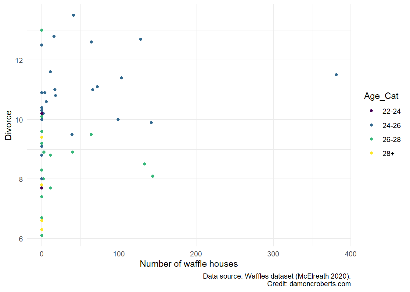
Now, let me take advantage of a scatterplot to not only examine the relationship between the presence of waffle houses and divorce but conditional on age.
waffle_cat %>% # grab the waffles dataset
    ggplot(
        data = .,
    ) + # make a ggplot object
    geom_point( # specifically a scatterplot
        aes(
            x = WaffleHouses, # put waffle houses on the x-axis
            y = Divorce, # put Divorce on the y-axis
            fill = Age_Cat, #fill the color of each dot by age
            color = Age_Cat #color the dots by age
            ),

    ) +
    scale_fill_brewer(
        name = "Age", # make this the legend title
        wes_palette("Moonrise3") # add these color palettes
    ) +
    theme_minimal() + # add the minimal theme
    labs( # adjust the labels
        x = "Number of waffle houses", # change x-axis label to this
        y = "Divorce", # change y-axis label to this
        caption = "Data source: Waffles dataset (McElreath 2020)"
    )